
Case Study: Gamers-Health
Concept Website 2023
Project overview: Rebranding and restructuring the gamers-health.com website
Role / Team
As my first project in the UX UI Design field among health specialists, besides creating a redesign for their website, I had the responsibility to communicate and guide the client through every step of my decisions to avoid unnecessary feedback loops.
Tools
Pen & Paper, Figma, Adobe Illustrator,
Midjourney
Client / Date / Duration
1 month
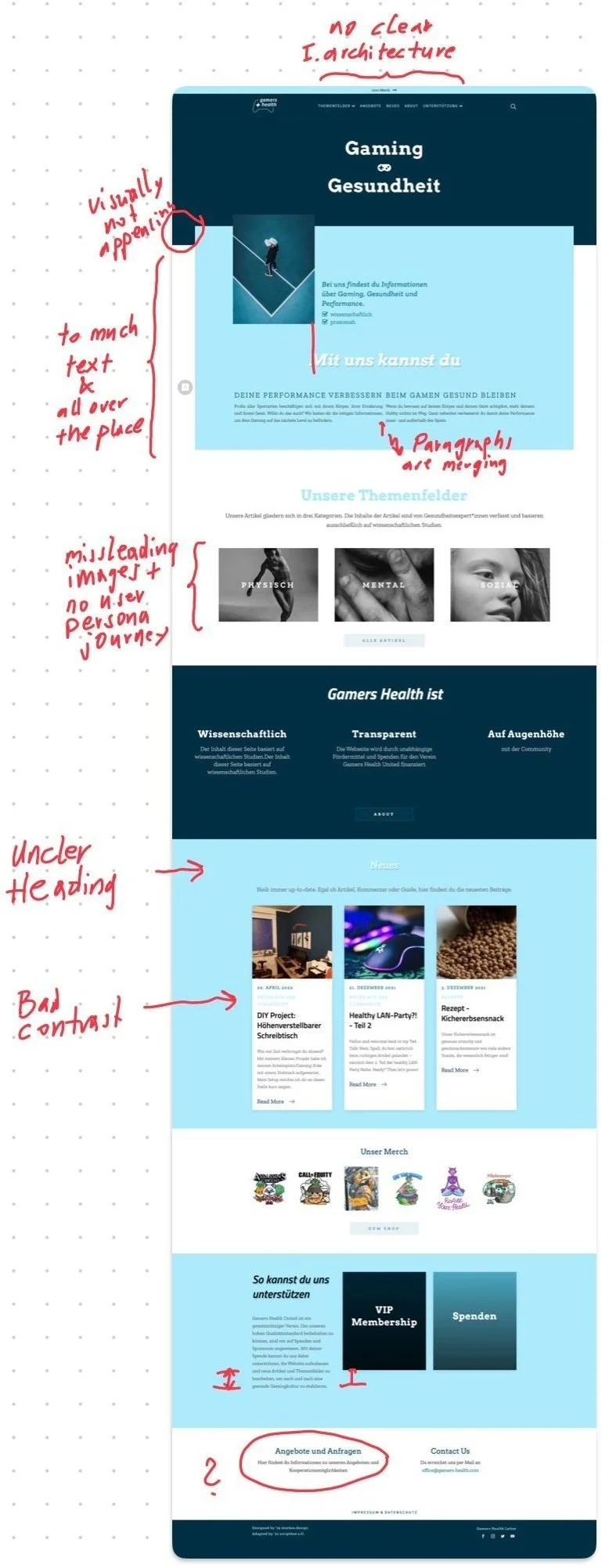
1. The Problem
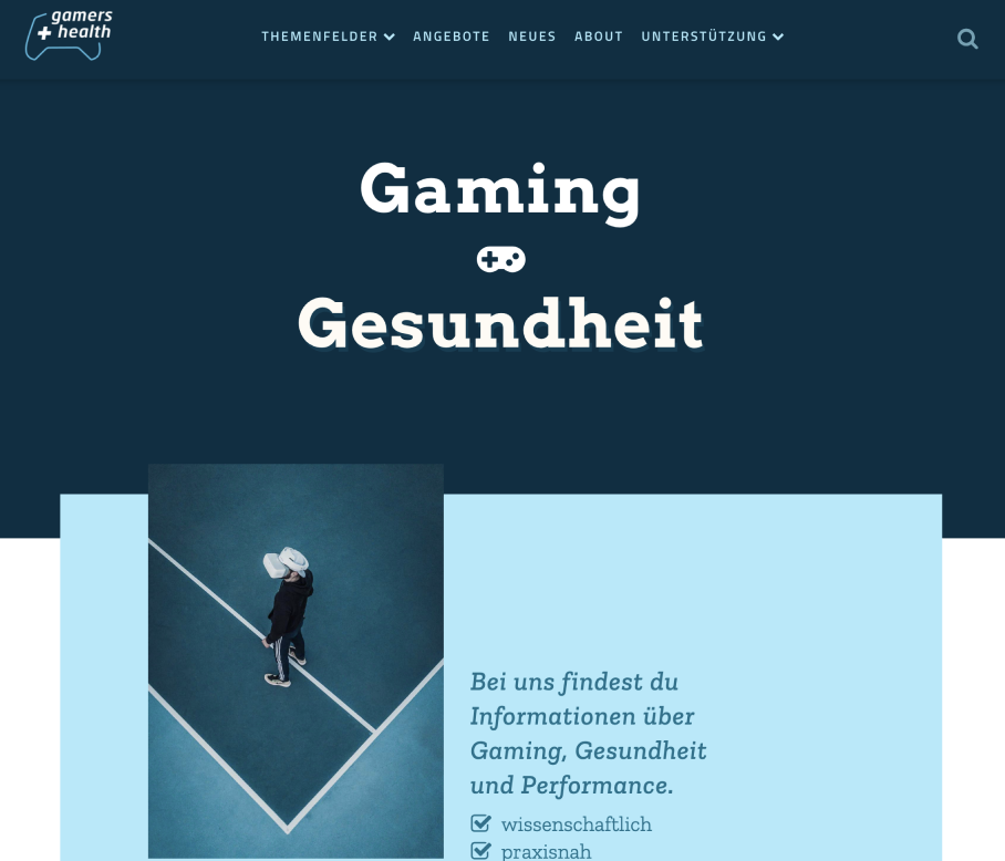
The non profit organisation gamers-health was founded back in 2018. Up until 2023, they used their initial website design to inform and direct their target customers to their provided services. But their conversion rate never reached a level of sustainability, so they asked me to look up and see where their website lacks a good user experience. →
2. Goals
Goal 1: Reorganizing the complete information architecture.
Goal 2: Bring their Corporate Design up to date.
Goal 3: Use their gained successes and experiences over the past 6 years and double down on their most successful channel.
3.1 Research
I took research notes across the web to get a feeling of what is already out there that fits into the criteria of gaming and health.
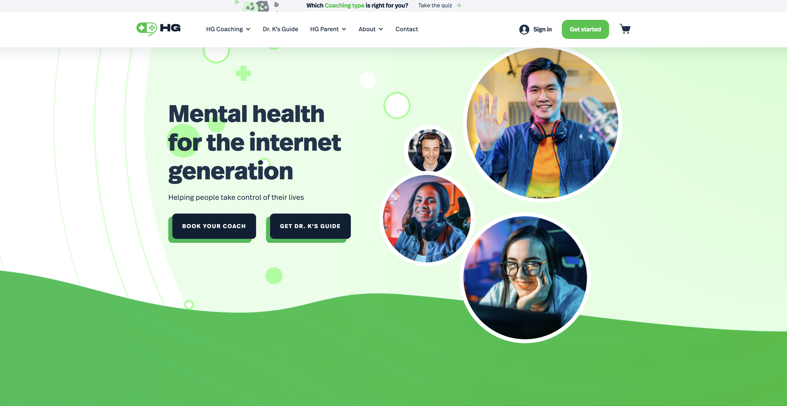
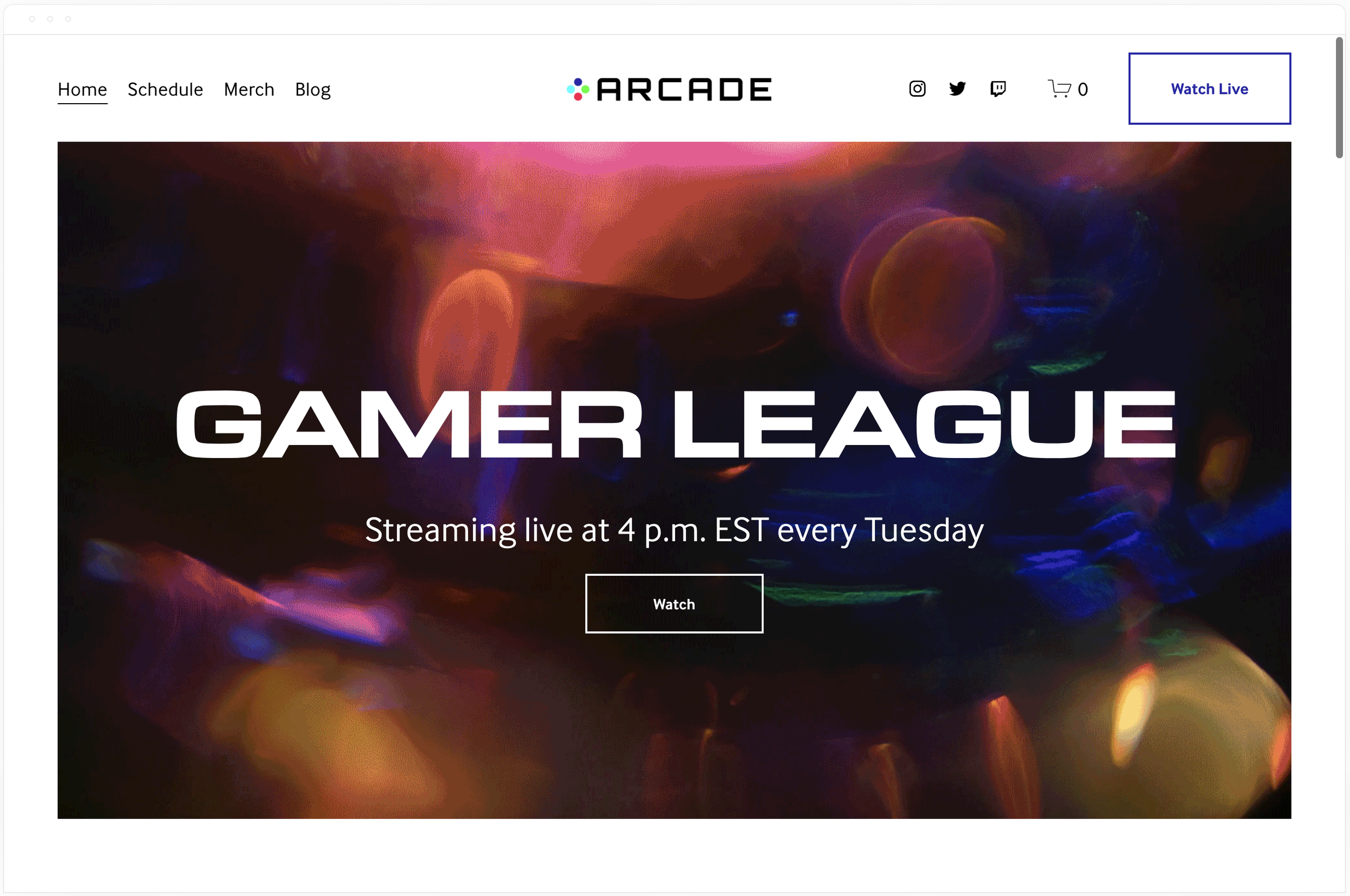
This website had nothing to do with health, but more so with gaming which was something the Gamers Health website lacked transferring that exact feeling — especially for the gamer user persona. →
←This American Website was a very good example of what gamers health lacked: a short oneliner to introduce themselves, some actionables to get going, and a clear information architecture in their menu.
3.2 User Personas
Write the key tasks that your users can do by regarding your study. Ensure your user persona contains the key tasks that your users can do by regarding your study, users’ priorities, Users’ pain points

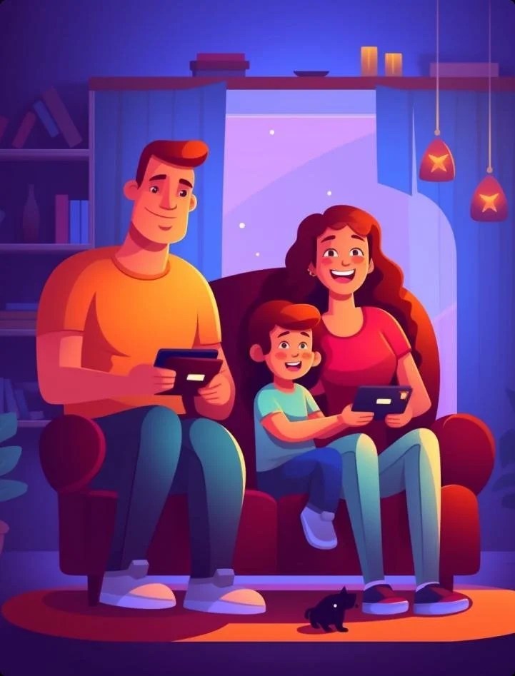
Gamers (of all gender aged between 13 and 28)
who play at least 2 hours each day.
Customer Goal: Wants to perform, stay healthy and
find community with like-minded people.
Customer Pain Points: Doesn’t know where to inform
properly and feels unaccepted by society while pursuing
his or her favorite hobby or future career.
How to reach them: Through videos & very short text passages
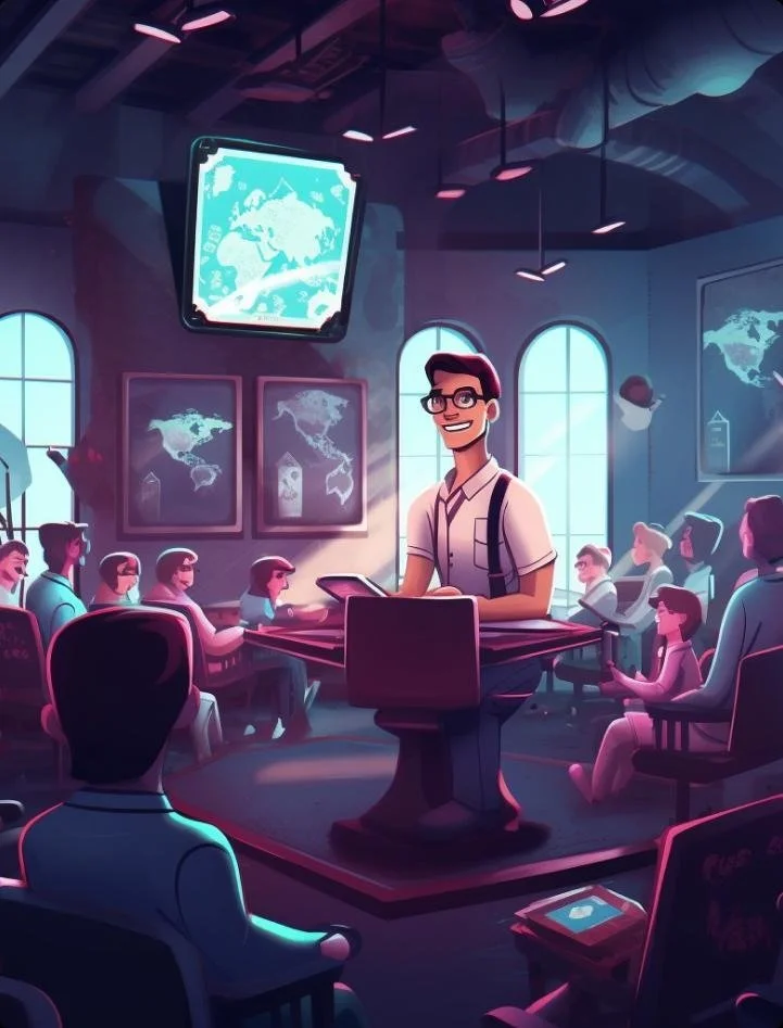
Multipliers (eg. School Teachers)
Customer Goal: They care most about the learning process and well-being within a group while in their care.
Customer Pain Points: They see the gaming culture unfolding through the pupil’s behavior in class and don’t shy away to get experts on board for a workshop to further spread knowledge and foster community when they lack expertise in such fields.
How to reach them: Through trust by proving that Gamers Health has the expertise and the pedagogical approach to reach the right pupils.
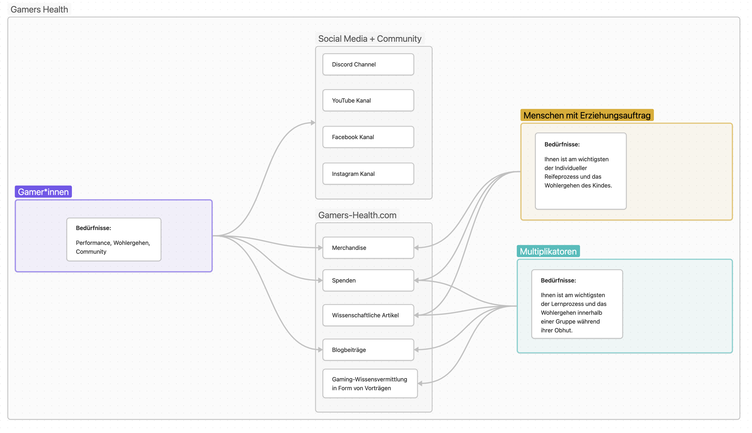
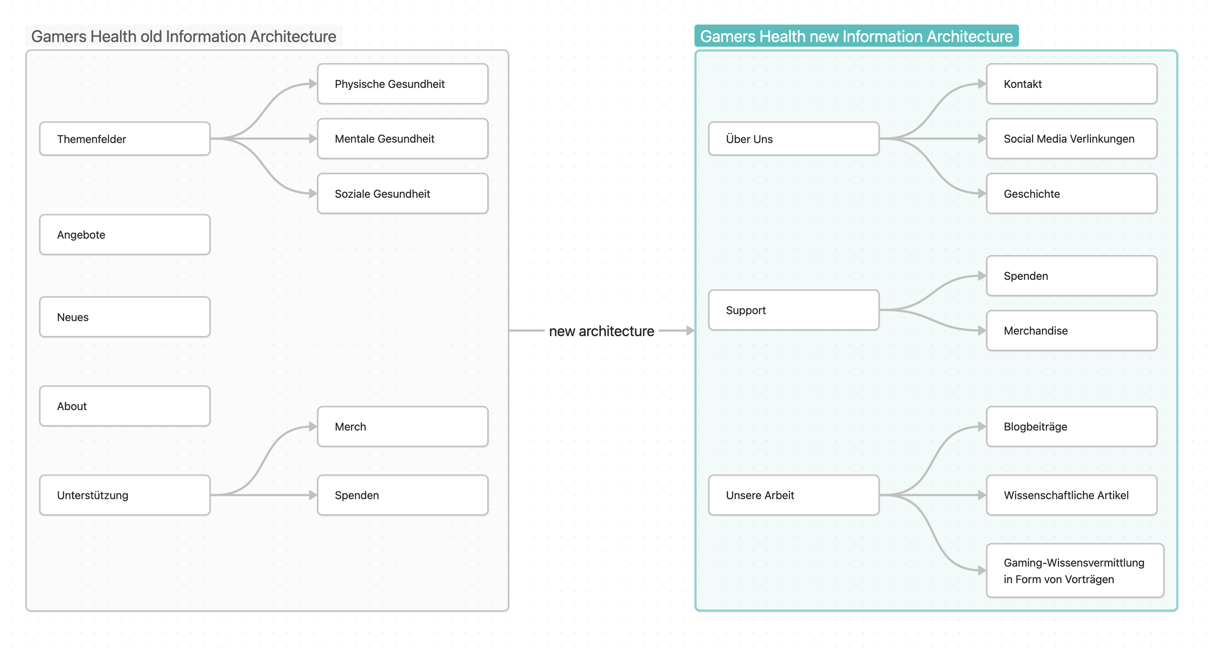
So what does Gamers Health provide now and which channels speak to their three user personas?
The image below shows an attempt to take the user personas research and rethink the information architecture. The Middle grey section shows what they actually offer and on the sites, we see which user persona is being targeted by what.
People with an educational mission
Customer Goal: The most important thing for them is the individual maturation process and the well-being of the child.
Customer Pain Points: They don’t see the full picture of gaming and fear mostly that the child won’t develop socially and professionally to the world's standards and probably will stay behind in the future.
How to reach them: Mostly through well-written text to ensure trust, or better, in person with an expert.
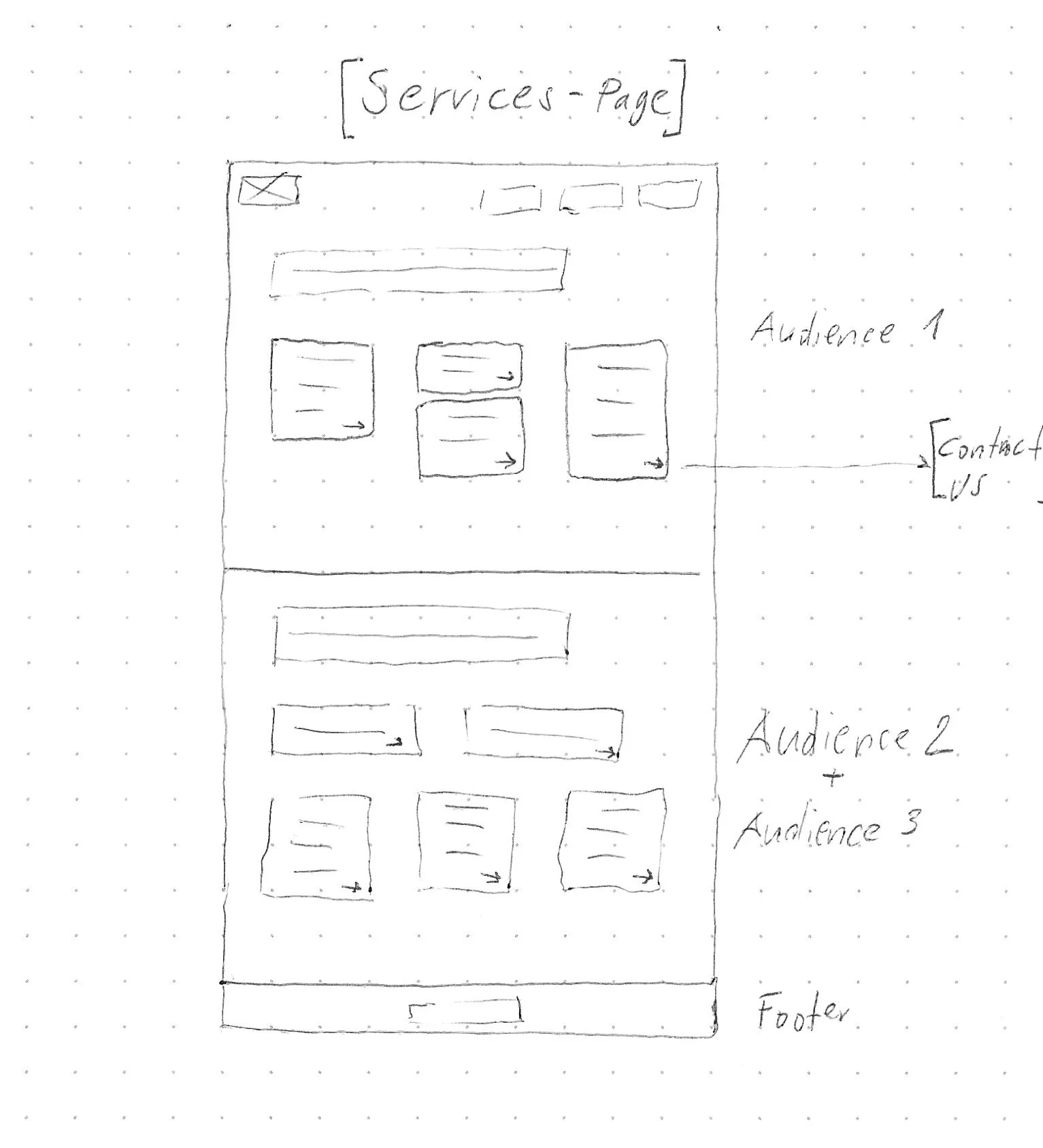
4. Information Architecture
With our gained insights, I then created a new clear way for every customer to guide themselves through the website and find everything within 2 clicks.
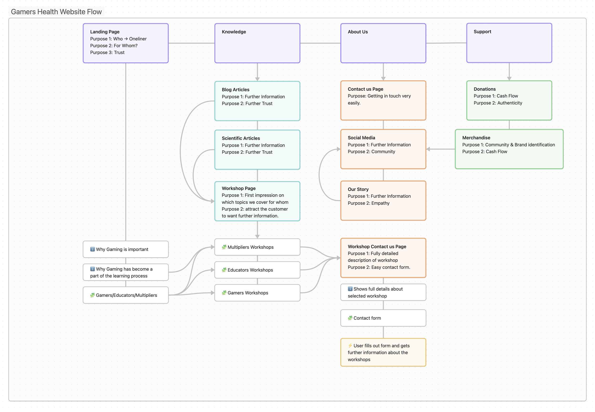
5. User Flow
Due to years of experience with their customers, Gamers Health found out that most of their customers actually want in-person workshops. This is why they now want to double down on that. Essentially every aspect has now been crafted to lead the customer one way or another to the workshops page as quickly as possible through multiple occasions on the website.
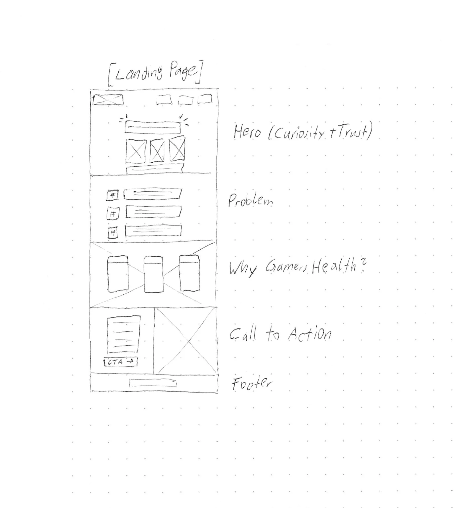
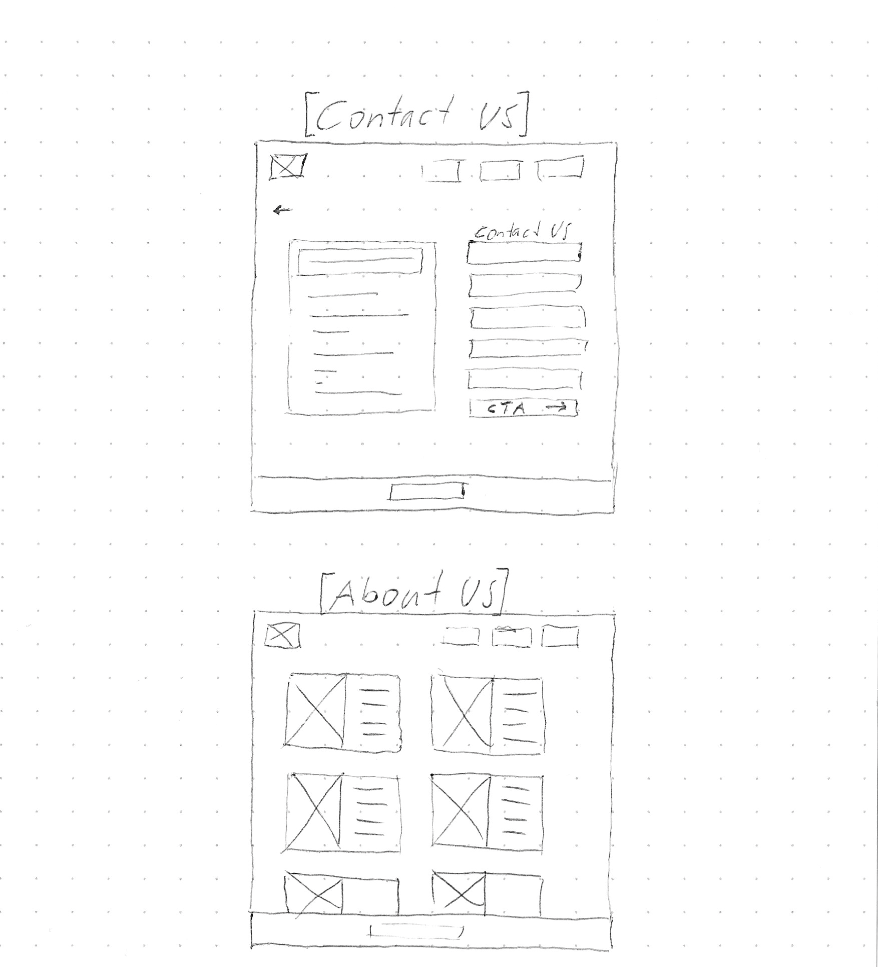
6. Concepts, Sketching, Wireframes
In this section, describe your process of working through your findings. This may include some notes on your discovery and/or research synthesis. It may also include low-fidelity explorations, concepts, prototypes, etc.
Anything that helped you explore ideas, possibilities, and possible solutions may be included here.
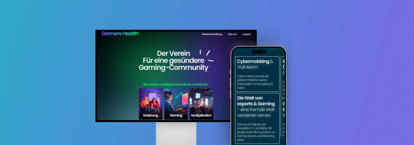
7.1 Visual Design
As they gave me total creative freedom I decided to update their color palette to not only combine the two worlds of “gaming” and “health”, but to give each one a world of its own. The logo then shows the transition which in the middle shows almost the exact blue tone Gamers Health had in their initial palette. It is where they come in.
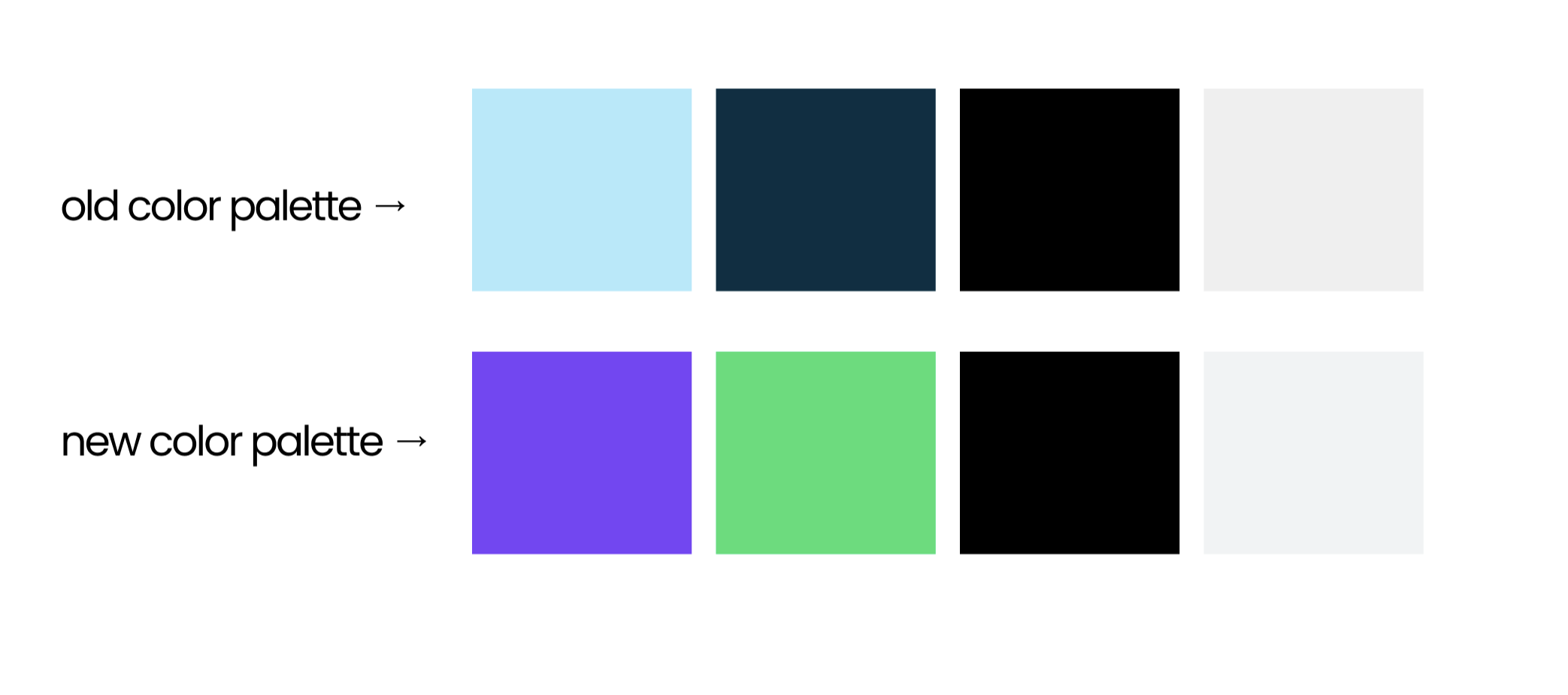
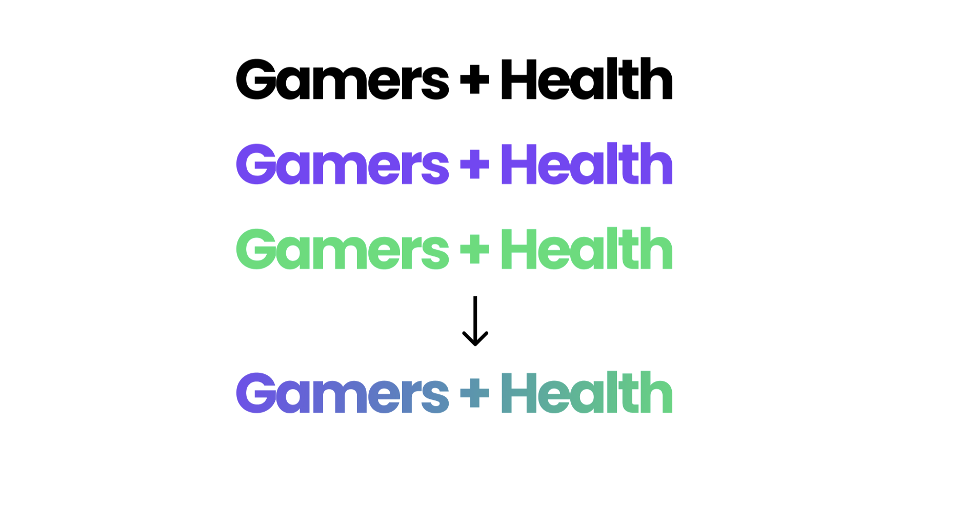
Purple: magical, extraordinary, imaginative, creative, original
Green: natural, healthy, positive, restful, fresh
7.2 Prototype
8. Challenges & Conclusion
Learnings:
As this was my first big project coming into UX UI I definitely learned a ton when it comes to what looks good vs a good user experience. From the first draft, where everything was ‘flashy and bouncy’, to a more mature and user-friendly site took actually some iterations to get it right. I now move on with huge insights and motivation for the next projects to come.
What’s Next:
With all these learnings I am confident to use Figma to create a professional-looking website. In the future, I want to double down on Usability Tests and further implement feedback and have more iterations to get the best website possible.